Oribi
Three products, built by three teams, looked like three companies. Over twenty weeks I audited 1,400 screens, designed one shared system and built its React library with the teams.
Client
Oribi, Rotterdam
Year
2025
Type
Design system
Role
Design and build
Team
Me, Oribi’s design lead and six engineers from three product teams
Live
Docs site, private
Twenty weeks
Eight of design, then twelve of build, with a release of the library every two weeks.
Weeks 1–3An audit of 1,400 screens across the three products, and interviews with 11 designers and engineers
Weeks 4–8Tokens, type and colour, then 86 components in Figma, reviewed with all three teams
Weeks 9–14The React library, starting with the ten components every product already used
Weeks 15–20The docs site, tokens exported to iOS and Android, and each team’s migration
Oribi’s freight platform has three products: one for shippers, one for carriers and one for warehouse staff. Each team had built its own buttons, its own tables and its own idea of blue. The audit found 23 blues and nine kinds of button.
That cost real time. A change to a status badge meant three pull requests, designers redrew the same table in every project, and customers who used two products felt they had moved to another company. Oribi wanted one system that three teams would choose to use.
Design
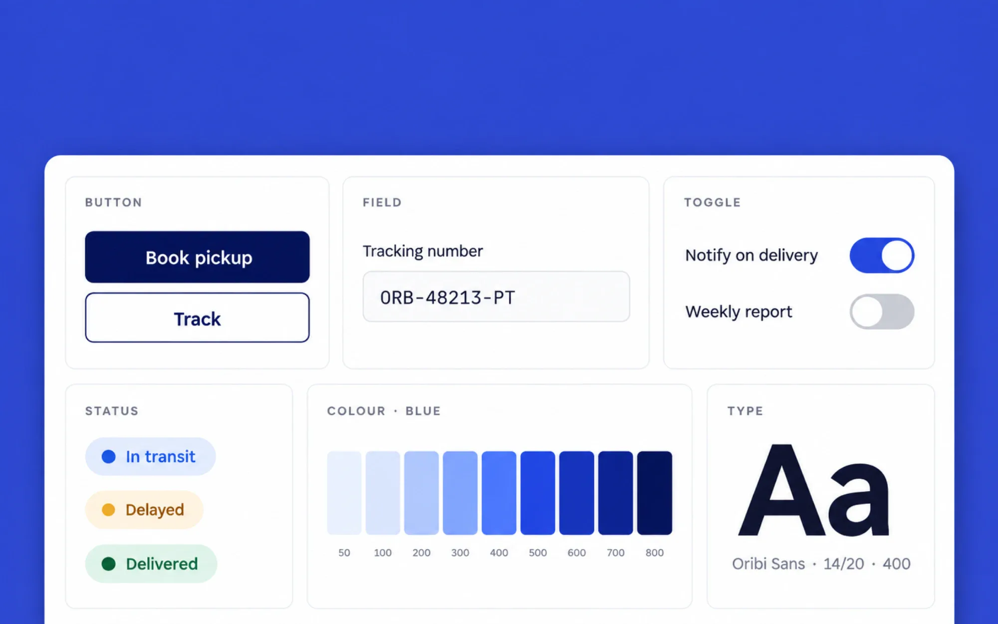
I began with the audit, then asked each team which parts they would give up first. Almost everyone said tables and forms, so the system starts there. Colour, type and spacing became tokens with plain names, so a designer and an engineer mean the same thing when they say “surface” or “muted”.
I drew 86 components in Figma, each with every state and a note on when not to use it. The three team leads reviewed them before any code existed.
An audit of 1,400 screens, sorted by pattern
Tokens for colour, type and spacing
86 Figma components, every state drawn
A usage note on every component
Build
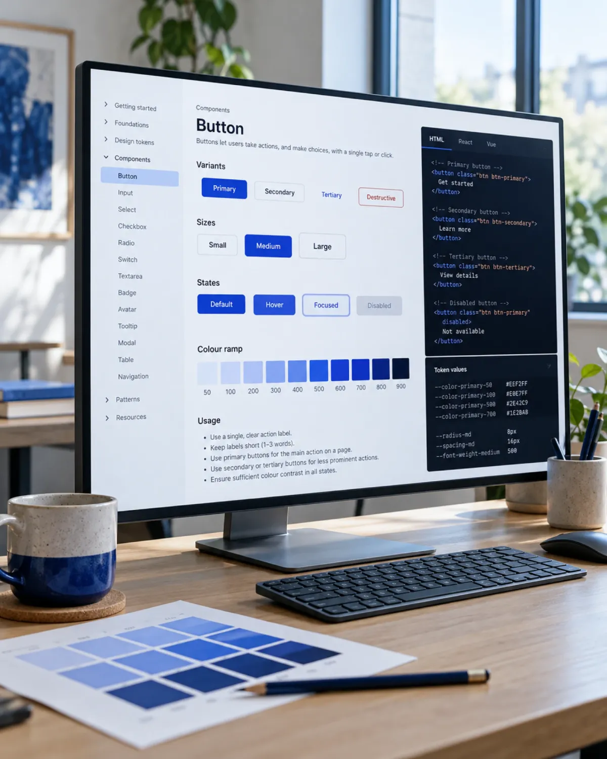
I built the React library on accessible primitives, so keyboard and screen-reader behaviour comes with every component. Each team adopted it one component at a time, next to the old one. The docs site shows every variant with live code, and the tokens are exported for the web, iOS and Android.
Library
React and TypeScript, on accessible primitives
Docs
A site with live examples for all 86 components
Tokens
Exported to web, iOS and Android
Adoption
One component at a time, with codemods for the old ones
The result
3 teams, 1 system
In five months, from the first audit to the last migration
−40%
Size of the average UI pull request once a team had moved over
9 → 1
Kinds of button across the three products
“A change to a status badge used to take three pull requests. Now it takes one, and nobody argues about blue.”
Sanne de Vries, head of product design, Oribi

Next project ·
03
Lumen Grid
Have a product that needs designing and building?